Book Club web app for a book club to keep track of what books members have read and when
March - April 2023 (design phase)
The Book Club does not have a single source of truth for which books members have read, when, whose choice it was and where they held the meeting
A web app to serve as an information hub for the Book Club with accurate statistics
Lead designer
User research, wireframing, prototyping, and usability testing
The Book Club is a self-organised group of 3-6 people (currently 4). Members take turns suggesting 3 books to read, from which the others vote democratically for one. They agree on a time and date to meet, this usually allows one or two months to read the book. All the organising happens in a WhatsApp group chat.
We conducted interviews with 3 members of the Book Club. We wanted to understand why they are still in the Book Club after months/years as it is a community-driven club with no financial or other tangible incentive to read and discuss books other than a love for books and spending time together.
An assumption we made was there being a need to save notes and quotes in one place that readers can later go back to. The interviews, however, showed only two readers confirming this.
All readers mentioned it being hard to look up a book they had read before if they can't remember the title or author.
There was a wide range of platforms readers consume their books on: physical copies, e-readers, audiobooks (via an app or sometimes even Youtube).
Minna is a Book Club member who needs a way to organise and keep track of Book Club meetings and the books they read because she wants to keep a record of all the books and meetings in one place.
We audited two book club apps, Bookclubs and Fable, and noticed that both have a very simple colour scheme in order to let the book covers stand out.
We did Crazy Eights exercises to come up with ideas for two problems: voting for a book from three options and finding a meeting time and date that works for everybody.
Using the voting feature in the Book Club app would require members to leave WhatsApp (where we currently handle all the organising), use the app, then come back to WhatsApp. This is way more hassle than using WhatsApp's new poll feature (or even just typing out the three options), so we decided to leave the voting feature out.
Finding a meeting time and date has been quite difficult in the group chat, however, moving this to the app would make the process easier only if everyone had an always up-to-date digital calendar that they wouldn't mind sharing, which not everybody does. Hence this feature was scrapped, too.
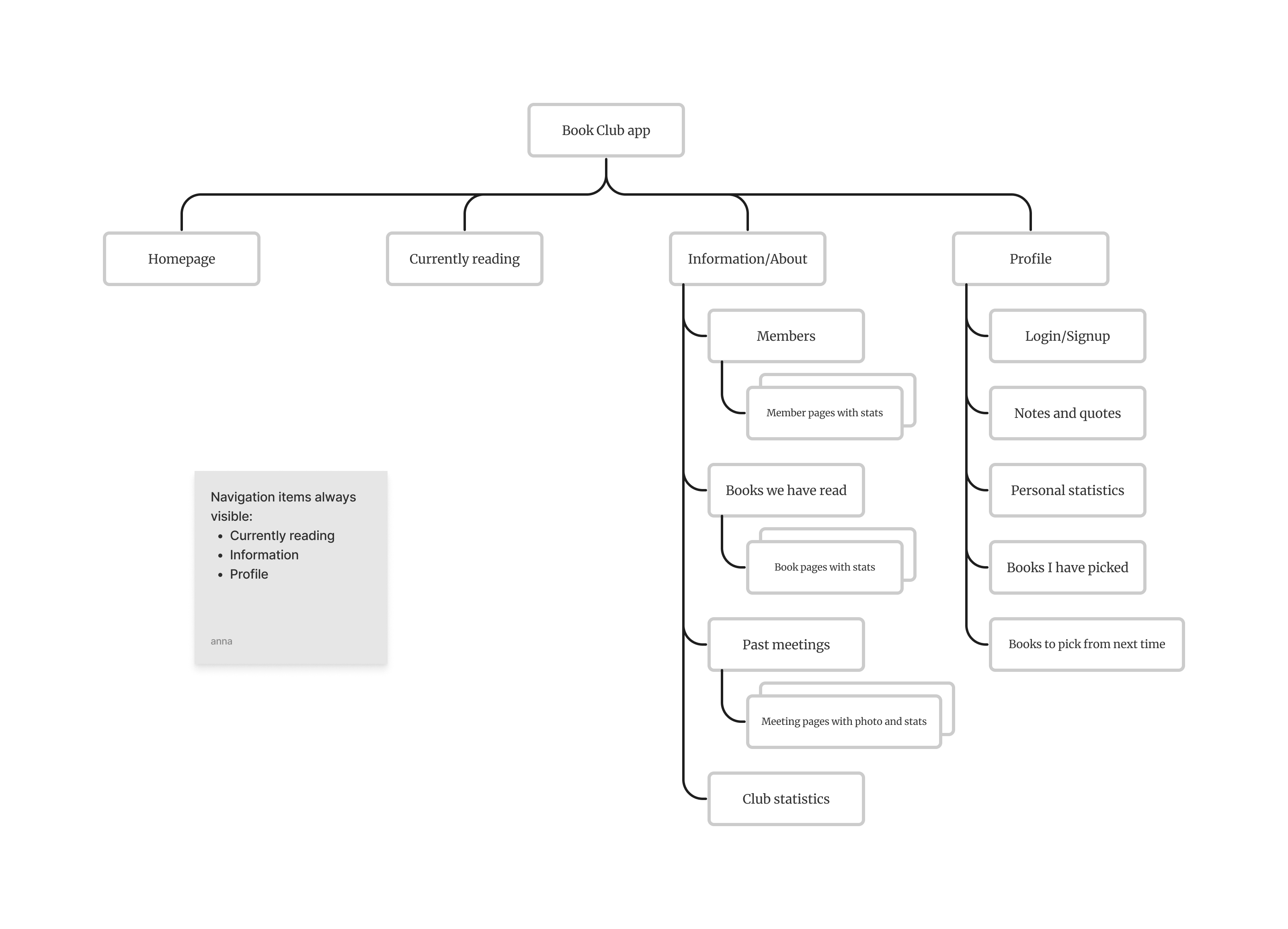
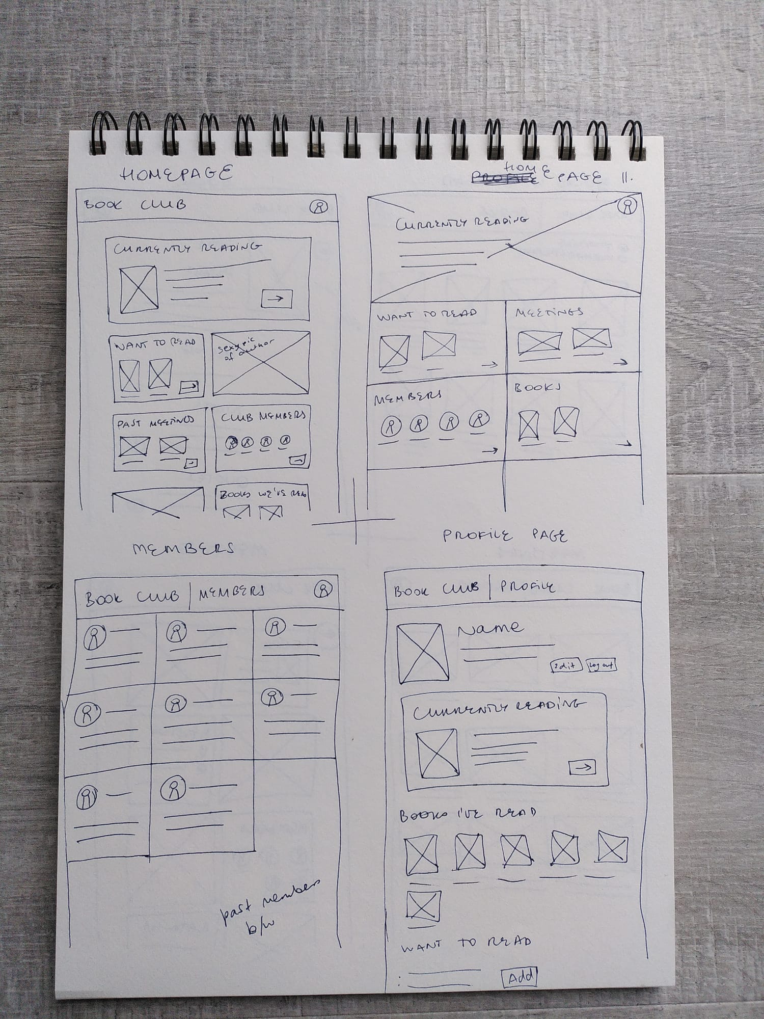
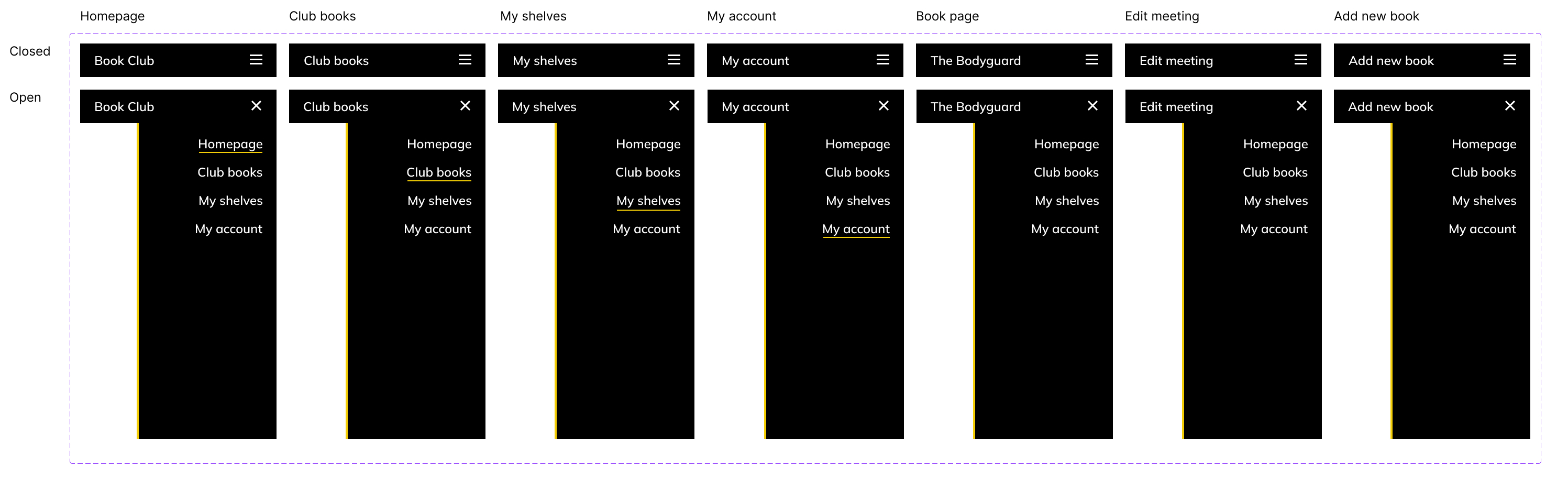
The first usability testing session showed that the initial low-fidelity digital wireframes based on this sitemap were highly confusing. What was the difference between a book and a meeting? Aren't they interconnected? So we started from scratch and created a new sitemap based on user stories.
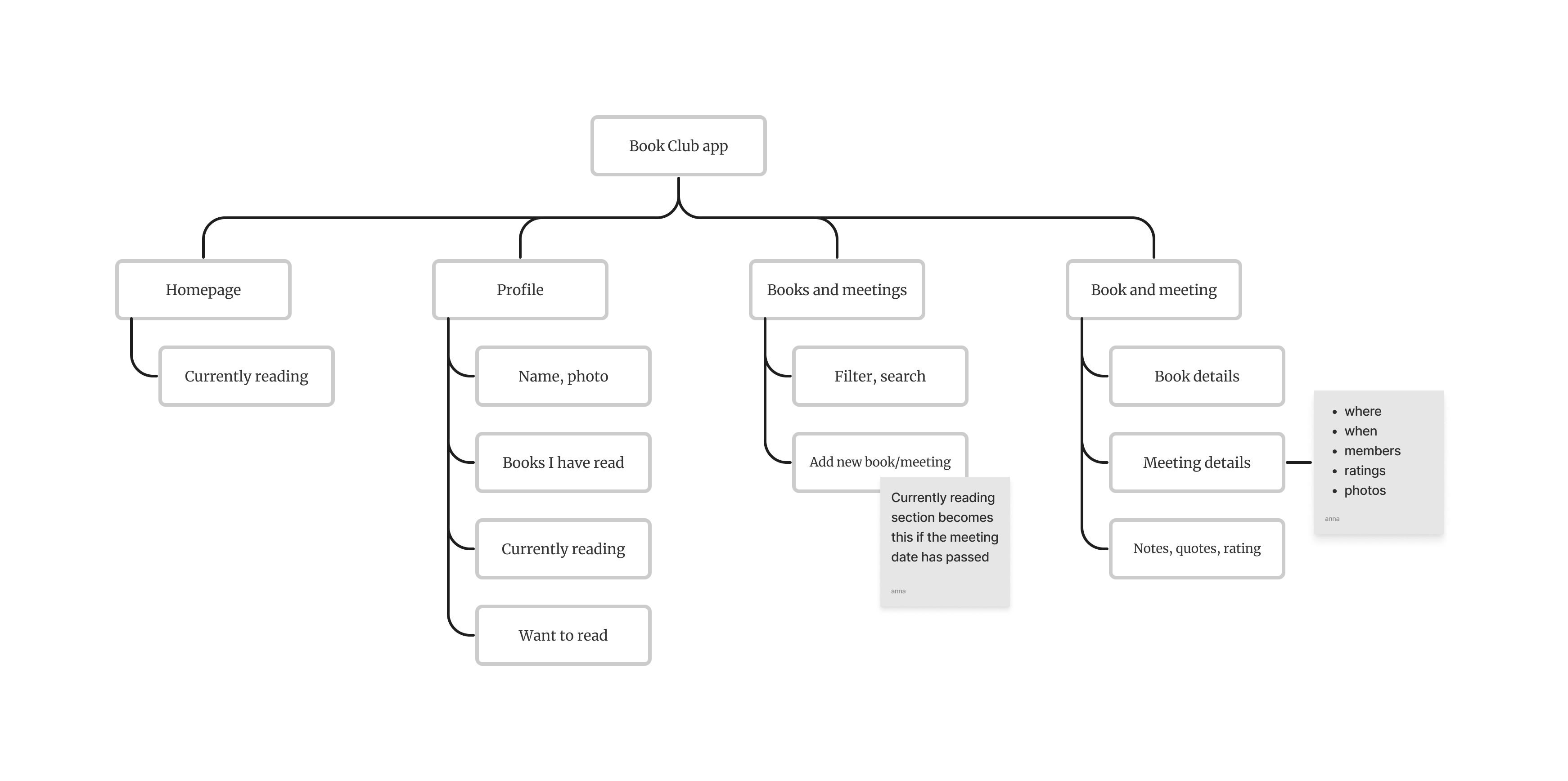
We merged books and meetings to be one entity and removed the "Members" page as it did not serve a purpose with the revised user stories.
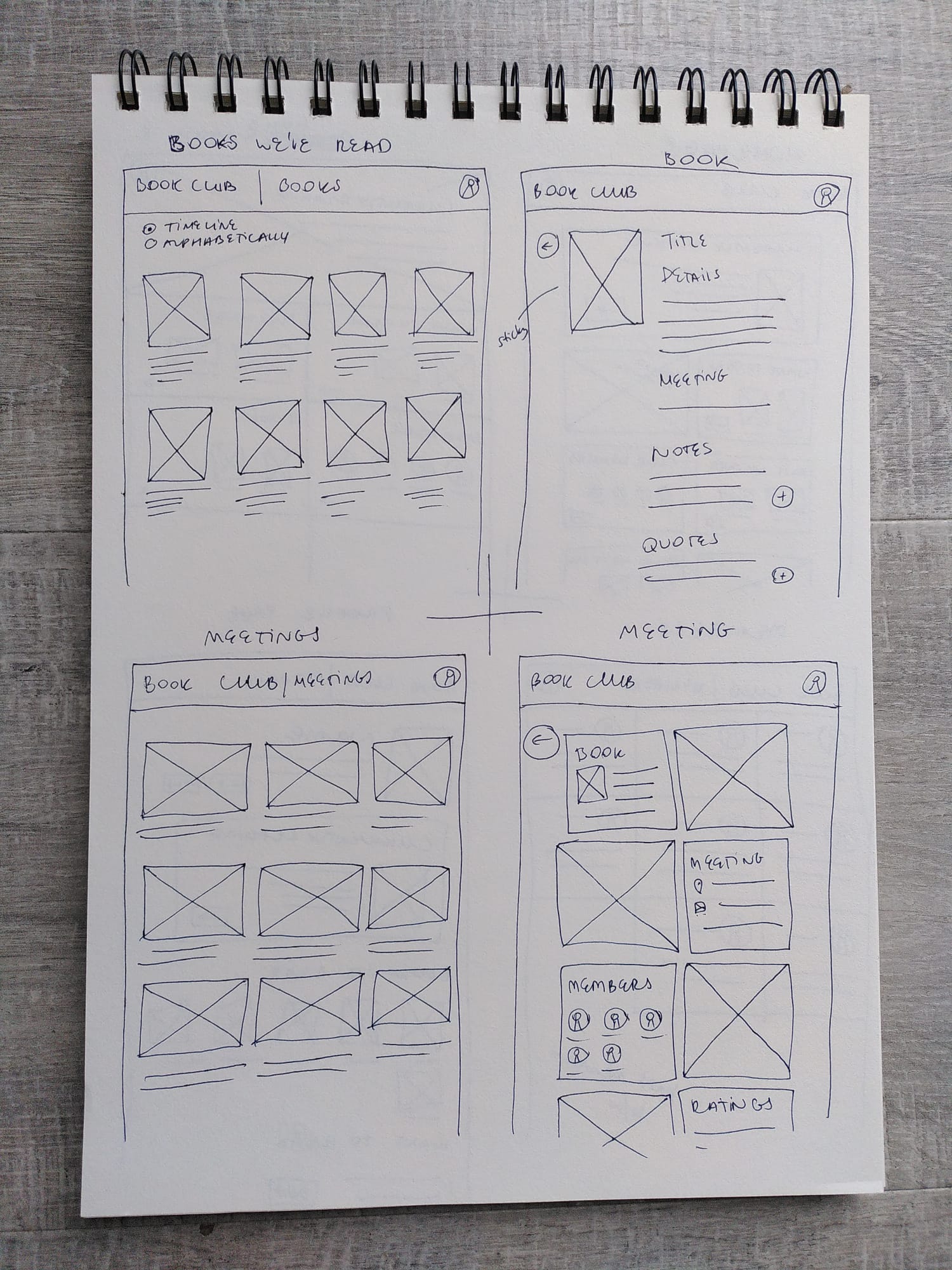
See more low-fidelity wireframes on Figma.
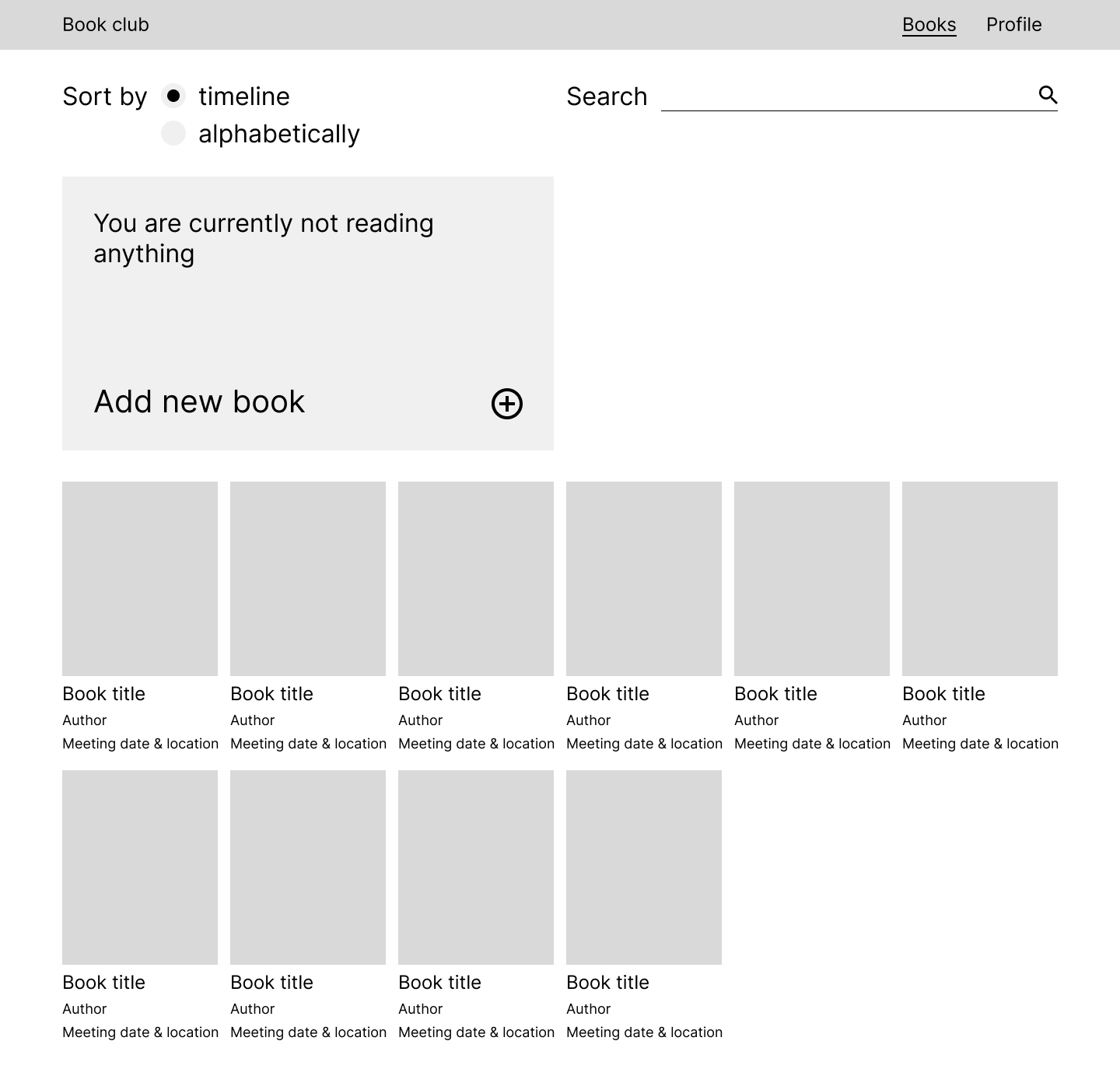
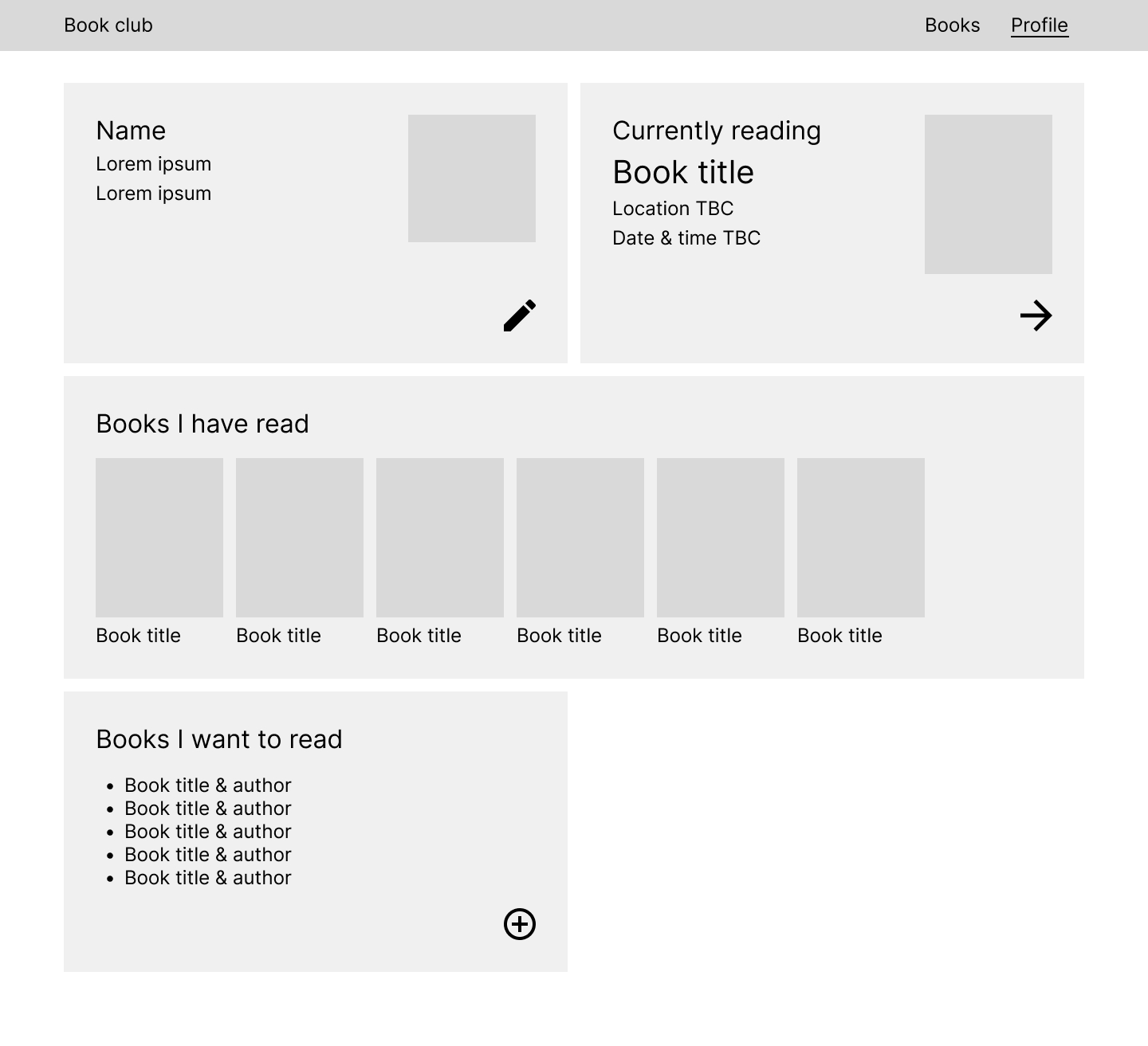
We used this low-fidelity prototype on Figma to test the app with real users.
Study type: moderated usability study
Location: online remote in the UK
Participants: 4 participants (all book club members or book lovers)
After compiling the findings with the help of an affinity diagram, we discovered the following themes:
How users search for books
Confusion over
Edit icon was not intuitive
Suggestions from users
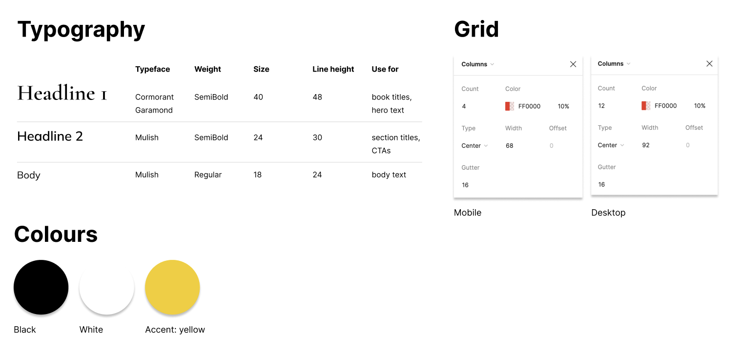
First of all, we created a sticker sheet with reusable components to make the process more streamlined and flexible.
I always keep accessibility in the forefront of my mind. We tested the colour contrast using WebAIM's contrast checker, and set the base/smallest font size to be 18pt. We made sure each interactive element has enough padding for bigger fingers or shaky cursors. We made each interactive element stand out so users can be certain about what they can click or tap. I will liaise with the developer to make sure that there is a logical flow for keyboard and/or screenreader users and that the headings are in a hierarchical order.
We turned the most common components into Figma components for ease (navbar and CTAs).
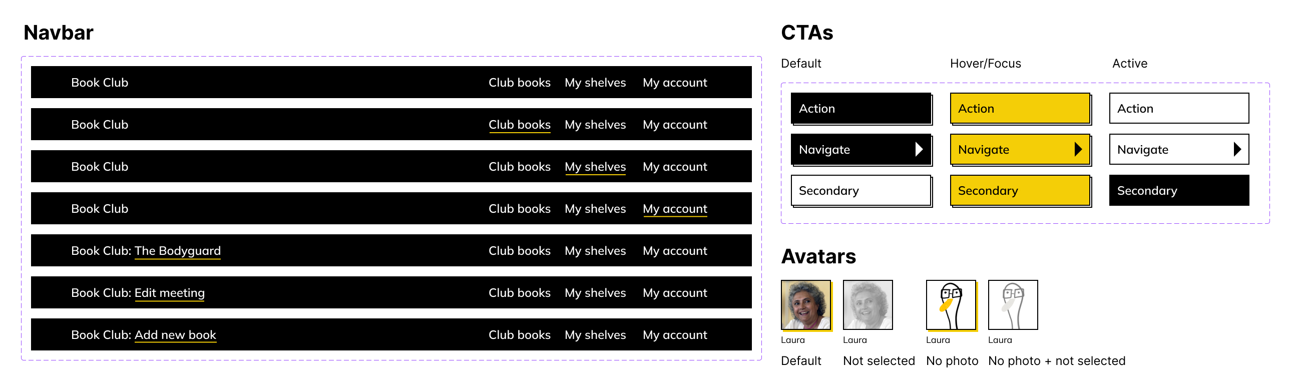
I used a Wacom digital tablet to create some simple illustrations (they are the Book Club members' favourite animals enjoying some literature!) to spice up the otherwise simple colour scheme and designs.

We designed for desktop and mobile screens, and used the smallest possible frame for both. This will make it easier for developers to implement the designs. The grid we used also restricts the content to never overflow on huge screens and stay legible and skimmable to the human eye.
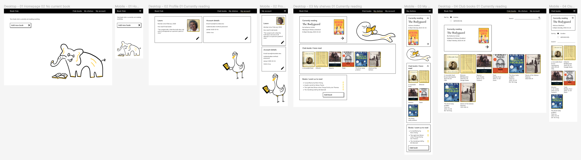
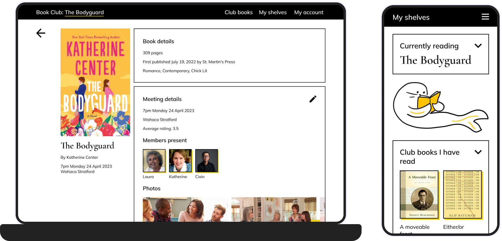
See all the high-fidelity wireframes on Figma.
We renamed navigation items for clarity.


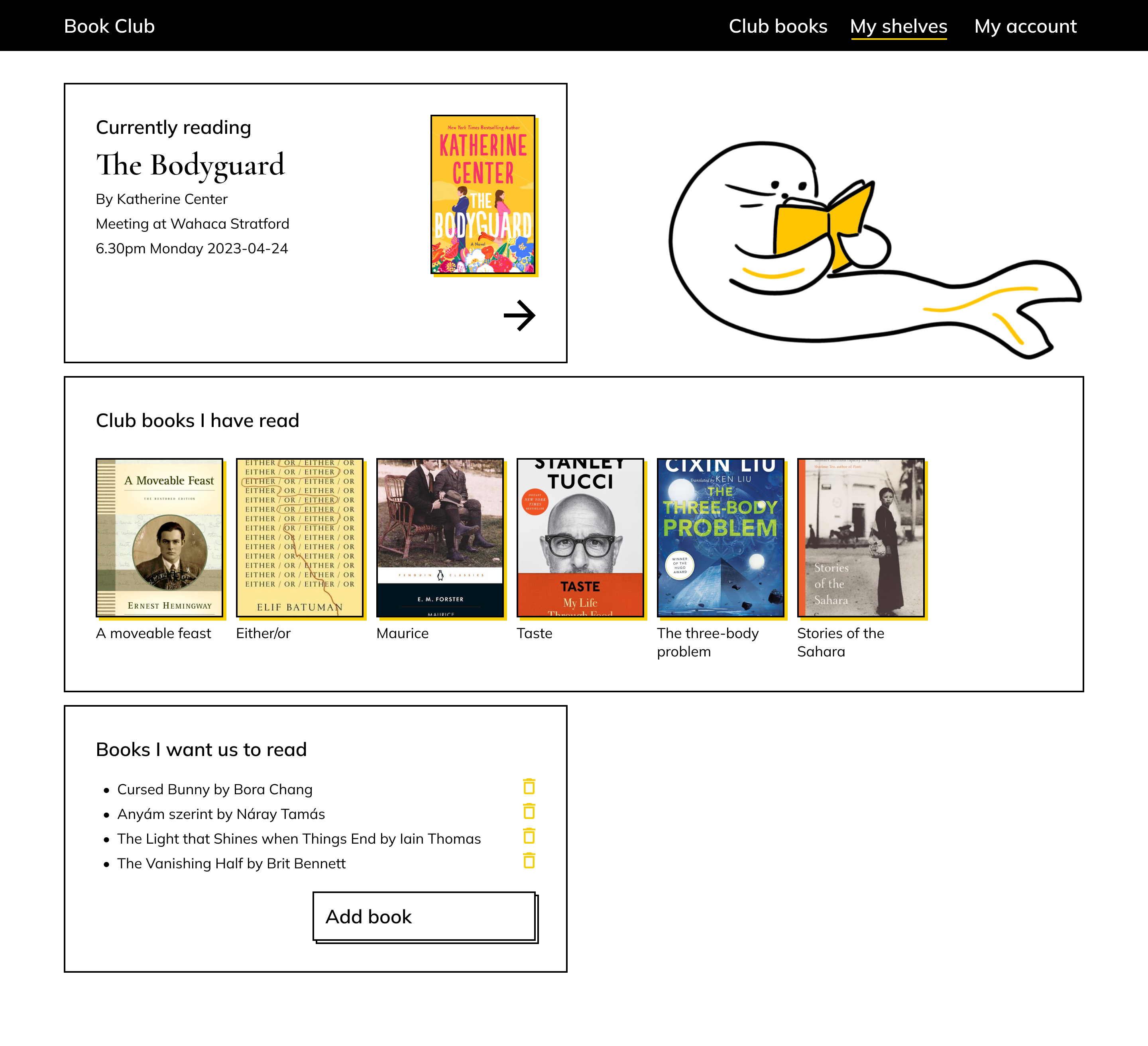
We renamed navigation items for clarity. "Books I have read" became "Club books I have read", and "Books I want to read" became "Books I want us to read" to make the scope of this page clear.

The second round of usability testing, where the tasks were the same as in the first round, was overall very positive. Users found the flow intuitive and pleasant. See the high-fidelity prototype on Figma.
Some suggestions came up that we will definitely consider:
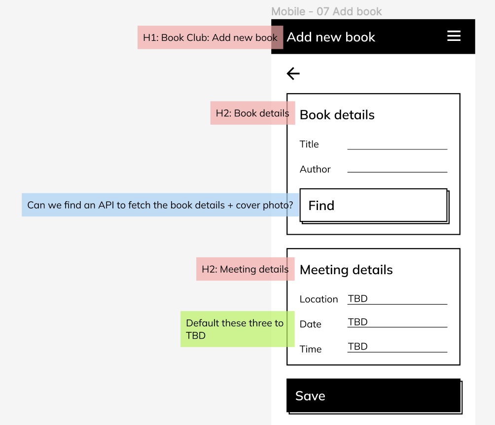
The app is currently in development. First, we annotated the Figma designs with heading levels, functionality comments and engineering questions. Then we sat down with the engineering team to go through the annotations and raise/answer any questions.